Thursday, September 29, 2011

Edit Me - 9.29.11

Edit Me
Disclaimer: This is not my photo. I did not take it.
Copyright belongs to the original photographer:
Kala over at The Wishful Lamb


SOOC:

My edit:

My steps in pse8 after adjusting sliders in ACR:
-levels
-Baby PowderRoom
-Faded Daydreams (tweaked)
-added a texture from My 4 Hens - one layer on soft light @ 90%, brushed off baby's skin.
-vignette


Tuesday, September 27, 2011

Texture Tuesday - Shoes I Love

The theme for Kim Klassen's Texture challenge today is Love. Rather than beg my husband to let me take photos of him (which he hates), I decided to use a photo of my Toms shoes, which I love!

I stopped at the beach last week in between work appointments. I couldn't help but photograph shoes that I love at a place that I love. Plus, I love taking photos. Is that enough love??


And my layers:


The gradient map is red to green for a vintage tone. The Hue/Saturation layer is a slight desat, painted off the shoe. Both texture layers are on multiply, although one is only 33%. And the top overlay layer is the brushed on quote (from Kim Klassen).


kimklassencafe


Sunday, September 25, 2011

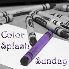
Color Splash Sunday - A Reminder


Welcome to Color Splash Sunday!

Color splash photos are those that have been converted to black and white, but one object has been left colored. Sometimes, it's easy to just isolate your colored object and you're done. Other times, more editing is required, such as adjusting color levels/light/shadow/etc.

This is an open themed link-up, so there won't be any specific themes for your photos. Any photo is fine, as long it was taken or setup by you, has selective color, and you haven't posted it before. You can read more about CSS guidelines by clicking here.


I don't have a selective coloring photo for today, unfortunately. Please don't let that stop you from posting your own color splash photos for today!

Before you link up, please be sure that you use the permalink to your Color Splash Sunday post, NOT the main url of your blog. Also, please only link up your selective color photos. I know a lot of you also participate in several other Sunday link-ups, and that is fine! Just be sure to have at least one photo with selective coloring. If you don't know how to make a photo with selective coloring, please click here to read my CSS main page.


Thursday, September 22, 2011

Edit Me - 9.22.11

Edit Me
Disclaimer: This is not my photo. I did not take it.
Copyright belongs to the original photographer:
Deb Duty


SOOC:

My final edit:


My steps: I did my usual thing in ACR, which is "adjust sliders until I see something I like." In pse8, I cropped, and then ran a few actions. I loved my third edit using the Cozy September action (tweaked) and a texture (nature's beauty from Kim Klassen), so that's the one I decided to post here. To see my other edits, click here.


Tuesday, September 20, 2011

Texture Tuesday - Autumn Buds

That title is kind of a lie. I took this photo in spring. But with the texture, it really looks like it was autumn!


Oh yea, there was no theme for KK's Texture Tuesday challenge today. I was really eager to use her autumn burst texture, and I just knew this photo would be perfect. The SOOC version, as well as my ACR clean edit, can be seen here.


Here are my layers:


The autumn burst texture is on soft light blending mode at 87%. The Hue/Saturation layer is a slight desat. The gradient fill is my soft vignette. And the seemingly blank 'layer 1' is actually those little white spots on the left side of the frame. I selected them off the texture, copied into a new layer, pulled it to the top, and added a drop shadow for that 3D effect.

kimklassencafe


Sunday, September 18, 2011

Color Splash Sunday - My Favorite Summer Drink


Welcome to Color Splash Sunday!

Color splash photos are those that have been converted to black and white, but one object has been left colored. Sometimes, it's easy to just isolate your colored object and you're done. Other times, more editing is required, such as adjusting color levels/light/shadow/etc.

This is an open themed link-up, so there won't be any specific themes for your photos. Any photo is fine, as long it was taken or setup by you, has selective color, and you haven't posted it before. You can read more about CSS guidelines by clicking here.


I really didn't get much feedback regarding the top 3. I guess, for now, I'll go back to what I was doing in the spring. Thus, I will only be posting my top 3 favorite photos IF there are at least 6 entries. If anyone wants to give their opinion on the matter, please don't be shy! You can comment here or on my facebook fan page, or you can email me (yma367 at hotmail.com).

Here is my photo for today:

**Please note that the inlinkz list will close on Tuesday at 12noon EST. This is a permanent change.


Friday, September 16, 2011

Edit Me & Macro Friday - 9.16.11

Edit Me
Disclaimer: This is not my photo. I did not take it.
Copyright belongs to the original photographer:
Kathryn from Our tiny BIG Life


SOOC:

My ACR edit:

And my final edit:


To get the vintage feel in ACR: increase warmth/fill light/brightness/vibrancy, slide tint to the left, and decrease contrast/exposure.

After that, I opened in PSE8 to run a high pass filter. I also added an artistic watercolor filter and a texture from My 4 Hens (one layer on overlay @ 30% and one layer on soft light @ 90%). Lastly, I used the CoffeeShop Web Color Block It action to add the color block.


And here is my photo for Macro Friday:


And an update on my life... ?

Sure, why not?!

Umm, let's see: I started traveling for work 2 days ago, although my body refuses to accept it. The long days, the hours spent in the car, the insane amount of coffee I am drinking, the increased pressure on my feet/hips/back from standing... I guess my 5th year of this lifestyle will be the hardest one to acclimate to. Don't get me wrong; it's still oodles of fun and I love it. It's just that transition period that's kicking me in the booty. I spent the past 10 months sitting in my comfy chair, in my little office, getting lazy. Now I have to get back in gear for 2 months of a completely different life. For those of you who don't get it, I mean life as a college admissions counselor. I plan on capturing 'A Day in My Life' at some point this fall, which will give you a much better understanding of it.

Speaking of fall, it's definitely starting here in southeastern New York. The leaves have already started changing color. I splurged at Old Navy the other day and bought myself a new fall jacket, just in time, too! The days are less humid; the nights are cooler. I'm ready to turn the AC off and throw open the windows, although Jon is not too keen on the idea. It seems that nerdy gamers don't enjoy fresh air like crazy hippies do.

Speaking of Jon, I love referring to him as "my husband" or "hubby." Looking at his ring makes my heart giggle. We are truly enjoying married life together! It took awhile to get to used to being married; however, now, we are embracing it. We're cooking-dinner-together, clothes-strewn-on-the-floor, lazy-Saturday-TV-on-dvd-marathons married. And we are planning to enjoy this period of lives as much as we can. For a certain period of time. Before changing it up with babies or houses or the like.

I know you all want to know, because that's what happens when people get married. Generally, they have babies and/or buy a house. And yes, we want babies and a house. Just not yet.

Well, that was kind of a lie. We love babies (and houses) and want them now. Except that we don't want them yet. So we're waiting. And while we kinda sorta have a plan for the future, we're more inclined to go with the flow for now. We want to see life has in store for us.


Oh wow, I just previewed this post and realized it's kinda long. I'll end it with just one more thing: I updated my 30 by 30 list! Go check it out.


Wednesday, September 14, 2011

Quotography - Reflections

Originally, for this theme, I wanted to use a photo of a lake with a reflection of a bright blue sky. However, when I saw this quote, I knew I had to use a photo from the honeymoon. We had 2 wonderfully sunny days at sea during our cruise, during which I took lots of photos! I just love the glittery reflection of the sun on the water.


Quotography at {My}Perspective


Tuesday, September 13, 2011

Texture Tuesday - DO what you can...

Let me tell you about today's challenge for KK's Texture Tuesday. The theme is the verb, "do."

I was so lost when I read this! I didn't have any ideas. Finally, I grabbed a random photo of some water droplets, slapped a random texture on it, and used KK's brush to paint "Do what makes you happy" on it.

I didn't like it.

So I scrapped it. I just deleted it. And I mentally bookmarked the challenge to work on another day.

When I was ready to tackle it again, I Googled "quotes about doing your best" because I wanted an inspirational quote that wasn't too concrete. A quote from Theodore Roosevelt popped out at me right away, even as I clicked through several different pages of quotes. I jumped over to pse with a vague idea of what I wanted, and found this photo of some lavender. This photo has been resting in my "to be edited" folder, just waiting to be rediscovered and processed to its fullest.

Here is my end result:


When I opened this photo in ACR to adjust sliders, I specifically decreased the saturation to -100. I knew I wanted a black and white photo. I then increased the exposure, brightness, and contrast, as well as adding in more blacks. When I switched over to pse8, I adjusted the levels quickly, but then got disgusted by the noise in the background. (I usually run noiseware BEFORE editing, but this noise was created when I increased the exposure in ACR.) After resaving and reopening, I added 2 textures - golden and aurora, both by KK herself. I neglected to write down my blending modes or opacity for these. I do know that the Hue/Saturation layer is a slight desaturation. And then I added the quote, the one that inspired me: Do what you can, with what you have, where you are.

Here are my layers:


And now that I look at it again, I think I switched the possible blending modes. I think the golden layer is actually linear burn, and the aurora layer is soft light. But I'm not positive. I guess I am not entirely 'with it' right now. It took me much longer than I would have liked to get back into the swing of things after the wedding and honeymoon, and I start traveling for work tomorrow. After increasing my travel territory last year, it's been decreased again this year, but I have more in-office responsibilities. As of right now, I'm not sure how much time I'll be able to devote to blogging, although I was able to manage my time efficiently enough last year that I am confident I can do it again this year. Additionally, I won't be planning a wedding!

As much as I love you all, I must end this post sometime today. I'll be back soon!

kimklassencafe


Sunday, September 11, 2011

Color Splash Sunday - Red Inside A Flower


Welcome to Color Splash Sunday!

Color splash photos are those that have been converted to black and white, but one object has been left colored. Sometimes, it's easy to just isolate your colored object and you're done. Other times, more editing is required, such as adjusting color levels/light/shadow/etc.

This is an open themed link-up, so there won't be any specific themes for your photos. Any photo is fine, as long it was taken or setup by you, has selective color, and you haven't posted it before. You can read more about CSS guidelines by clicking here.


There will not be any top 3 favorite photos during the summer.... However, summer is pretty much over at this point. Everyone is back to school, the nights are getting cooler, and the stores are proudly displaying their Halloween inventory. So, shall we start doing the top 3 photos again? Honestly, though, it's been much more enjoyable for me to just appreciate everyone's color splash photos without feeling pressured to pick "the best" or "my favorites."

Please let me know what your thoughts are in a comment! Or you can email me at yma367 at hotmail.com.

Here is my photo for today:

**Please note that the inlinkz list will close on Tuesday at 12noon EST. This is a permanent change.


Saturday, September 10, 2011

iPhonography 9.10.11

How cool is today's date?!? It's 9-10-11!!

Simple pleasures.


Anyway, here is last month represented in instagram photos:


And here are some wedding photos that I took with my iPhone:

Clockwise from top left: my ring & band, Jon wore a kilt!, hairstyles of 2 bridesmaids, my tiara that used to be my grandma's, hairstyles of 2 more bridesmaids, 4 of my girls at their last dress fitting, my girls in the limo, my hair is long!, a gift, 2 of my girls at the last dress fitting, my dad in the limo, relaxing during cocktail hour, my bridal bling from the bachelorette party, and my hairstyle.


Linking up with the following blogs:

iPhone Photo Friday at Adrienne Rose Photography
iPhonography at One Mom's Perfect Imperfections
Phonography at Pasando
InstaFriday at Life Rearranged


And I have to end this post with a message for my husband even though he will only read it when I show it to him:

Happy birthday, Jonathan! I love you more than you think, and I can only hope to somehow be able to express it to you at some point in the future. I'm glad we have the rest of our lives together, because it really might take me that long to find the right words to truly explain how much you mean to me. I am so happy that we have officially started our married life, and I am uber-excited for all the possibilities that the future holds for us. ♥


Thursday, September 08, 2011

Edit Me: 9.8.11

Edit Me
Disclaimer: This is not my photo. I did not take it.
Copyright belongs to the original photographer:
Jill Samter


I used to put my Edit Me posts up on Fridays, but due to a few different factors, I am now going to put them up on Thursdays.

SOOC:

My edit:


My steps:
When I opened in ACR and started adjusting sliders, I added warmth but actually slid the tint slider back to the left. After doing some other adjustments, I also decreased the contrast, which is unusual for me. It just felt right.

After opening in pse8:
-straighten
-crop
-Hue/Saturation layer to adjust vibrancy of reds and greens
-PW Boost tweaked, to add some extra zing
-Ashley Sisk's Debonair tweaked
-2 rustic textures from Shadowhouse Creations, both on overlay @ 100%
-vignette

My thoughts: I like it! A lot. I'm pretty proud of myself for being able to put more creative focus on the barn. Also, I can't recommend Jerry's textures enough. They just work wonders on photos.