One of the blogs that I found that was extremely helpful was the Daily Window, written by Lynda. She has been writing about textures and actions the past few days, and she has challenged us to edit her photo with our favorite textures and actions.
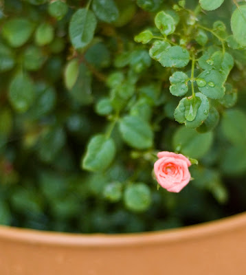
Here is the sooc shot:

Before I even opened this in pse, I first applied noiseware to it. Ashley over at Ramblings & Photos has recommended this program at least twice, so you know it's good. Now, I use it on almost every photo I edit. Sometimes, the noise is inevitable. If I don't like that the noiseware softens some of the details, I then use the Sharpen This action from Pioneer Woman to hone in on specific details I wanted to sharpen. (I've got a pse version of her actions, but I can't seem to find the link. I'm pretty sure Coffeeshop and Texas Chicks worked together to recreate PW actions for pse.)

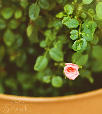
When I opened it in pse, I immediately used a Levels layer mask to adjust the colors to my own liking. Then, I applied two of my favorite actions. This first edit is done using the Butterscotch Vintage action from Coffeeshop.

This second edit was done using the Morning Cartoons action from Amy McMaster.

I NEVER (okay, hardly ever) apply an action and leave it 'as is,' or 'out of the box,' as Lynda calls it. As I've pointed out before, there is no real right or wrong in photo editing. Most of the time, what looks good is based upon a person's personal preferences and style. If 3 people take the same photo and edit it, there will be 3 different end results. And all 3 of them will look good. So, after applying an action, you definitely want to look at each layer and adjust them according to your own taste. Make it look the way you want it to look.
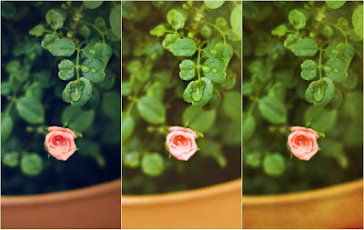
For my last edit, I didn't use any actions, just textures. I get all of my textures from Shadowhouse Creations because they are all free and they are so creative. I used two of his textures called Old World Painting 2 and RVT (Rustic Vintage) Green.

I have 3 layers on this photo, bottom to top: OWP2 set at screen mode with 38% opacity, OWP2 set at overlay mode with 50% opacity, and RVTG set at overlay mode with 75% opacity. On the first and third layers, I also masked out some of the effect over the rose and the wet leaves.
Here is a side by side comparison of my 3 edits.

Which one do you like best??
Head over to the Daily Window to check out more Lynda's tips and resources, and to try out her challenge for yourself!


7 comments:
I haven't ever looked at texturs or actions. LOL, maybe one day when the kids move out. Now that wont be in a few more years.
I don't know what one I like better,the first cos It is the most relistic looking, or the second one with its bright colors.
Awesome! Thank you so much for participating! That noiseware program is awesome. I guess I need to look into it.
You did a great job with your edits! I love them!
Wow, you are really good at all of this. I stink at using photoshop. I really need to take some courses and get better.
I like the one on the left best.
I love the first one with the darker green (Butterscotch/ Coffeehouse) effect. The second seems a little too bright and the third nice but I love the forest green of the first.
This is a tough one Amy! I like the first one and the second one! This is great! I want to start doing more edits with my photos! have a great weekend!
Mama Hen
I am only just learning how to edit my pictures like this so thanks for the great tips and links-I really appreciate it!
Best wishes for a fabulous week,
Natasha.
I like the third one the best- it is the warmth of the colours that really appeals to me.
BUT, though the edits are all great, it was a fantastic photograph to start with.
Post a Comment